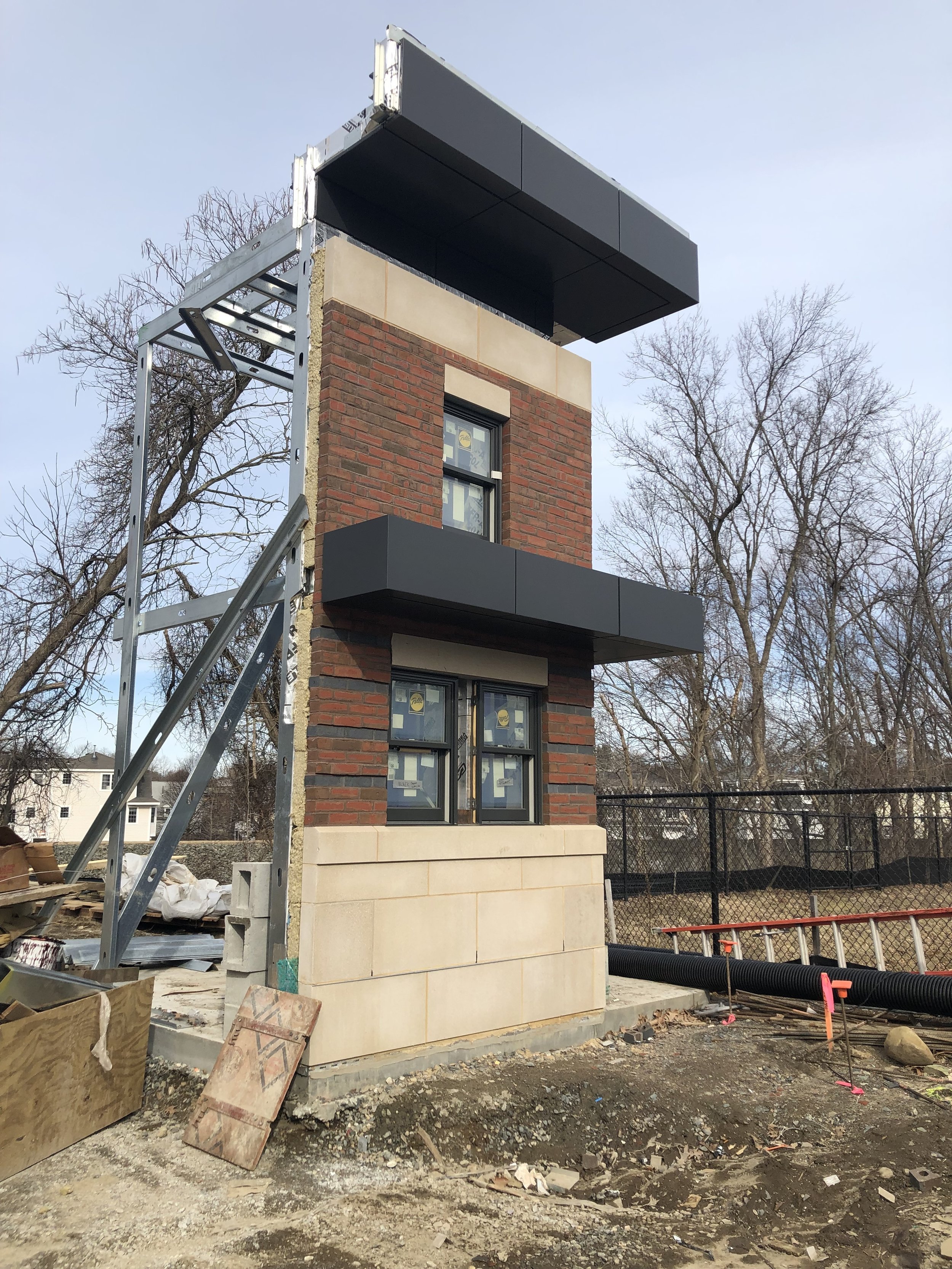
Check out Framingham Fire Station #2's Project Mockup
/The project team traveled out to Framingham’s Fire Station #2 site where the visual mockup of the exterior facade was ready to be reviewed. The purpose of a mockup is to provide a real-life visual of the facade in order to verify the designs aesthetic better than what a rendering can provide.
The design team selected two colors of brick veneer, water struck and manganese iron spot brick. The manganese iron spot brick was designed to run in tight bands along the street facing areas giving the building dramatic shadow effects. Continuing the theme black metal panels top the cornice and provide a canopy over the main entry. Cast stone was selected to anchor the building’s base and to top off the masonry.
The team also checked on the building’s masonry work, which is over 50% complete. The masons began their work on the East side and have quickly maneuvered clockwise around the building completing each face as they go.
We are looking forward to seeing the project come together!


